How to Use Color Psychology to Influence Mood and Decor
Color isn’t just decoration—it’s design language. The right palette can turn a neutral space into a calming retreat or a vibrant hub of energy. In fine art photography, color psychology becomes a way to influence how a room feels the moment you walk in. Whether you’re designing for serenity, creativity, or warmth, here’s how to use color strategically in your art and decor.
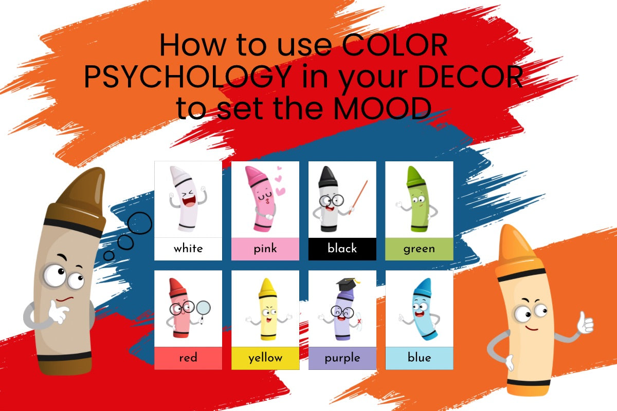
The Basics of Color Psychology
Color psychology studies how hues affect human behavior and emotions. Each color carries associations that can shape the ambiance of a room. Blue is often linked to calm and trust, while red can evoke passion and energy. By understanding these associations, you can use color intentionally—selecting art and decor that supports the mood you want to create.

Common color associations:
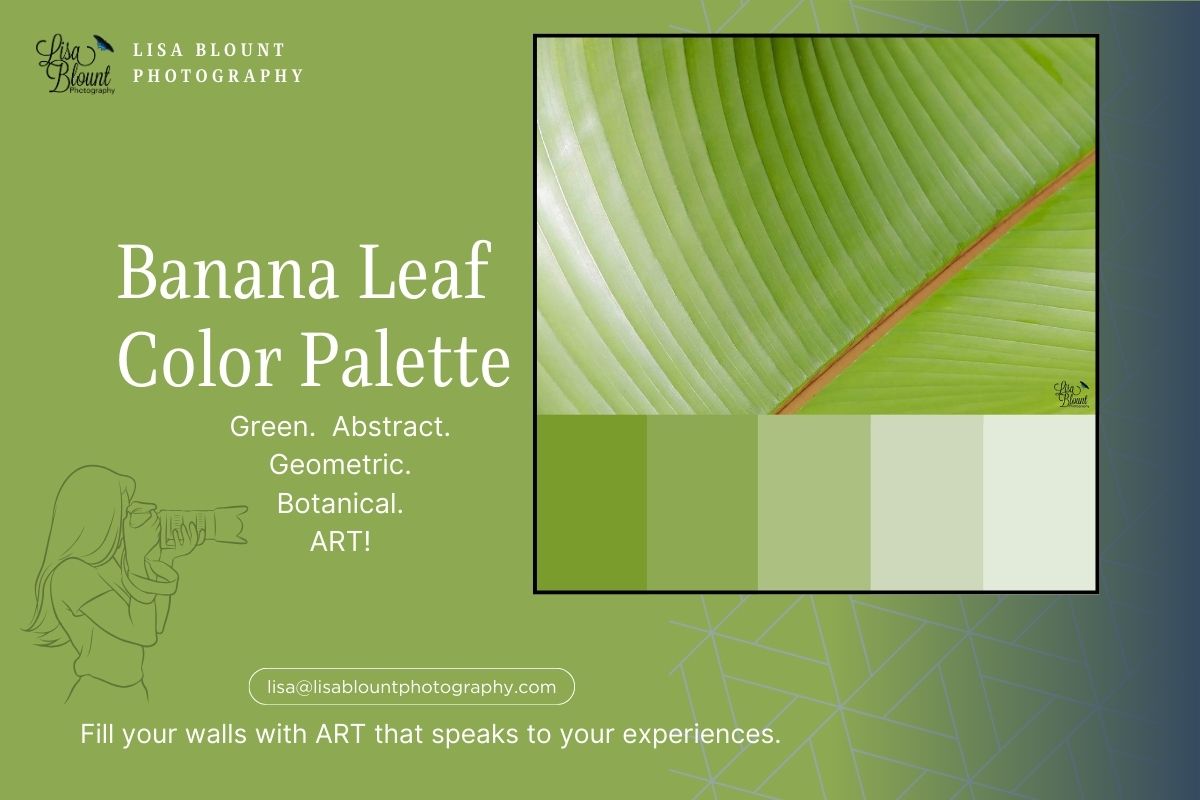
- Blue: Calming, trustworthy, peaceful
- Green: Refreshing, natural, balanced
- Red: Energetic, passionate, stimulating
- Yellow: Cheerful, warm, optimistic
- Purple: Luxurious, creative, mysterious
- Orange: Enthusiastic, sociable, inviting
- Neutral Tones (Gray, Beige, White): Calm, sophisticated, timeless
By leveraging these associations, you can choose art that aligns with the mood you want to create at home or in a project.
Color Trends 2025: Balancing Calm and Character
Designers in 2025 are leaning into “quiet color”—tones drawn from nature with soft warmth and grounding undertones. Think oceanic blues with misty neutrals, woodland greens paired with sand and clay, and muted blush or terracotta accents that bring comfort and depth. This balance of calm and character lets statement art stand out while feeling cohesive and timeless.
How Color Influences Mood in Photography
In photography, color sets the emotional temperature of an image. A tranquil blue seascape calms; a fiery sunset energizes. When selecting art, consider how the photo’s palette will interact with your finishes and textiles—and how it will influence the room’s overall feel.
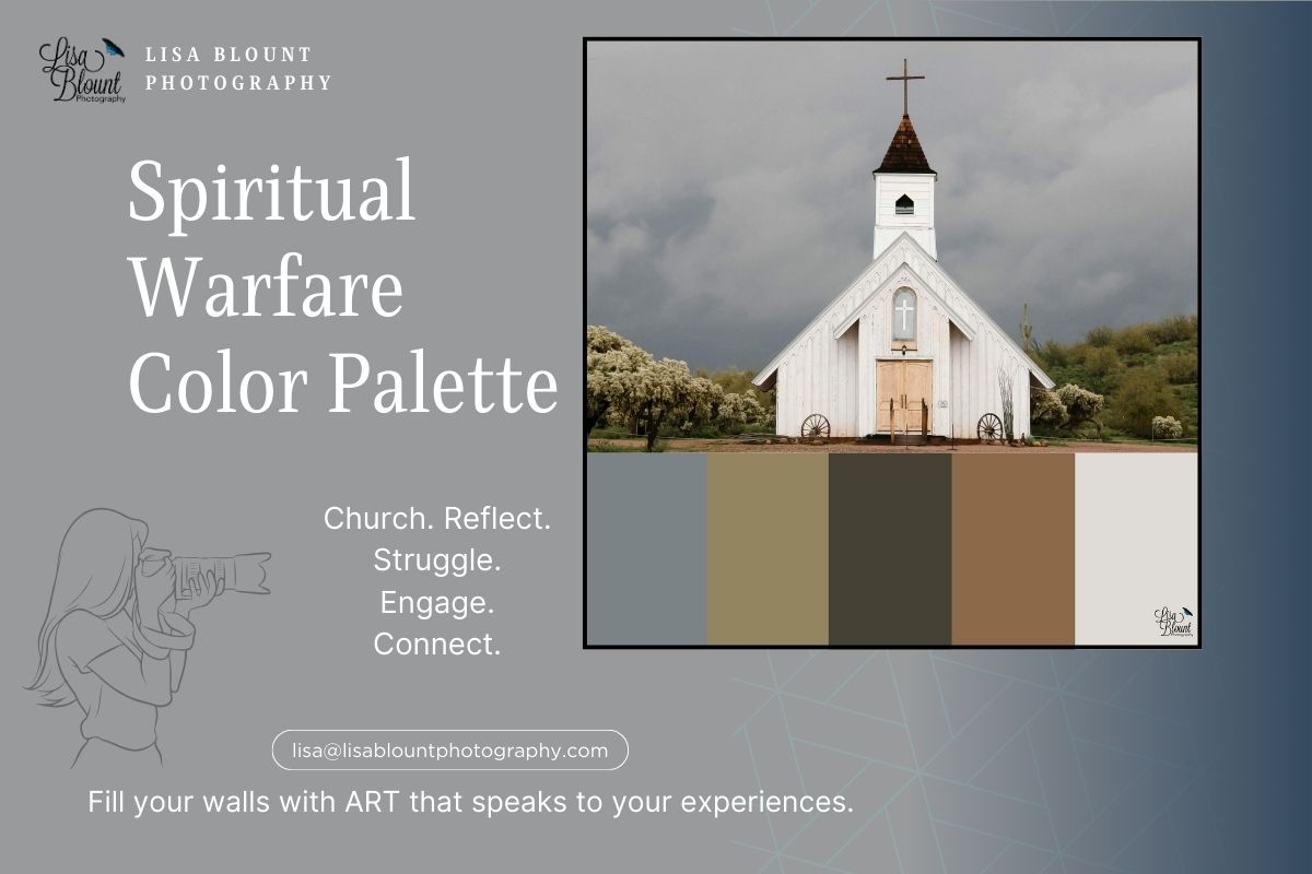
Calming Colors for Relaxation Spaces
For bedrooms, living rooms, and reading nooks, opt for blues and greens—hues known to lower stress and invite exhale. A serene lake, a misty forest, or gentle ocean waves can bring a restorative presence to your space.
- Choose artwork with soft, muted tones that blend seamlessly with neutrals.
- Use calming art in spaces designed for unwinding: bedrooms, reading corners, quiet sitting areas.
- Pair blue and green art with natural elements like wood, linen, or stone.
Energizing Colors for Active Spaces
For kitchens, offices, or home gyms, vibrant reds, oranges, and yellows can spark focus and creativity. One bold photograph—sunset glow, a vibrant bloom, or kinetic city light—adds vitality without overwhelming.

- Use bold hues in moderation; a single statement piece can do the heavy lifting.
- Match the scale to the energy—larger, more saturated pieces suit active areas.
- Balance brights with neutrals to keep the room from feeling chaotic.
Creative Colors for Inspirational Spaces
Studios, offices, or hobby rooms benefit from hues that invite imagination—purples, teals, and unexpected combinations. Abstracts, macro botanicals, or unique perspectives can become daily prompts for new ideas.

- Choose dynamic compositions and unexpected palettes to spark curiosity.
- Mix styles and scales for an eclectic, energizing environment.
- Hang creative pieces where you brainstorm, write, paint, or plan.
Warm and Inviting Colors for Social Spaces
In dining rooms, family rooms, and entryways, warm tones—golden yellows, soft oranges, sunlit reds—signal welcome. Photographs of sun-kissed landscapes or golden-hour scenes amplify hospitality.
- Use warm-toned art as a focal point over a console, sofa, or dining table.
- Layer cozy textiles (throws, cushions) to echo the warmth.
- Keep cohesion by aligning art with the room’s broader theme and finishes.
Selecting the Right Art for Your Space

Use this quick framework to align color and mood with your design intent:
Reflect on the Purpose of the Room
Is it for rest, focus, gathering, or play? Let function guide palette and subject matter.
Consider the Existing Color Palette
Note wall color, flooring, furniture, and textiles. Choose art that complements—or intentionally contrasts—your scheme.
Think About Scale and Composition
Large pieces with confident color make strong statements; smaller pieces add quiet nuance without dominating.
Prioritize Personal Connection
Choose images that resonate—favorite places, textures, and tones that spark memory. When art reflects your experiences, the room feels more meaningful and yours.

Final Wrap-Up Thoughts
The power of color runs deep. It’s beautiful, yes—but it’s also a tool that can shift how a space feels and how we feel within it. By understanding color psychology and choosing art that supports your goals, you can design rooms that are not only stylish, but also calm, energized, or inspired—on purpose.
Whether you’re drawn to tranquil blues, energizing reds, or the creative allure of purple, let your walls echo the colors of your life’s journey. Thoughtful art selection brings harmony, presence, and meaning to the everyday.
Ready to bring more mood into your decor? Explore nature-inspired fine art photography that transforms color into emotion. Each piece tells a story—let it be yours.
Explore More Inspiration
- Fine Art Photography Themes for Every Room
- Destination Decor - the trend to watch
- Browse the Flower Power Collection
- Mood Boards & Color Palettes
Happy decorating—add a little COLOR to your world! ~ Lisa

Leave a comment
This site is protected by hCaptcha and the hCaptcha Privacy Policy and Terms of Service apply.