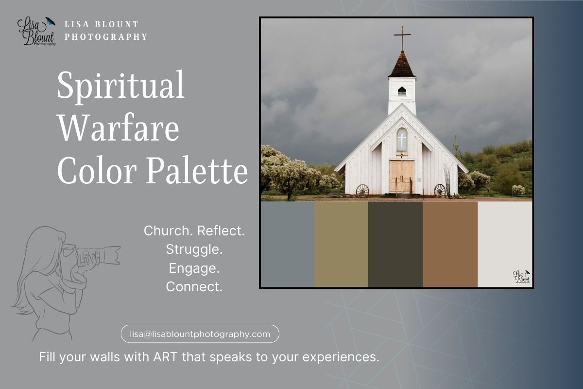
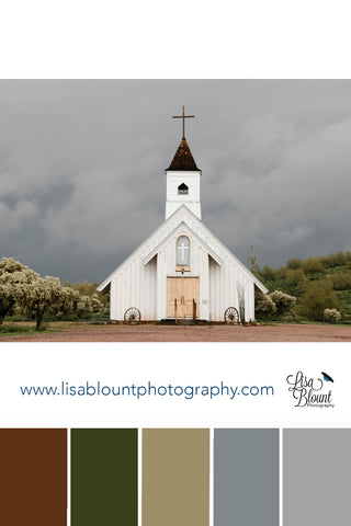
Spiritual Warfare – Color Palette & Meaning Behind the Art
Color Palette of Spiritual Warfare - Moody and Reflective

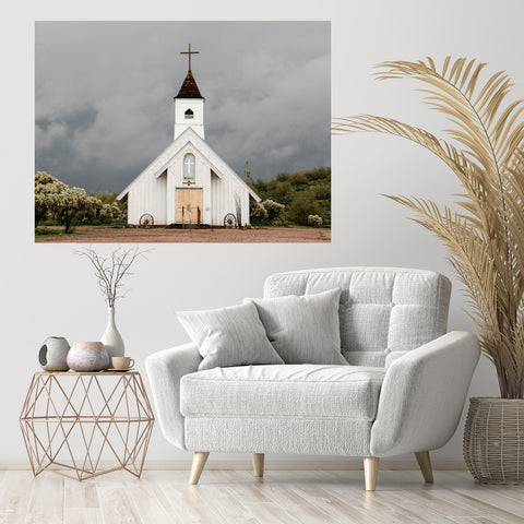
Spiritual Warfare is one of those pieces that stops you in your tracks. A quiet country church stands strong beneath dark, gathering clouds — a reminder that even in life’s storms, there’s still peace to be found. I captured this scene because it felt symbolic of those moments we all face — the tension between chaos and calm, fear and faith, doubt and hope.
The color palette mirrors that contrast perfectly — with moody grays, soft whites, earthy browns, and deep greens that reflect both calm and unease, faith and endurance. Each color tells a part of the story.
What Is a Color Palette?
A color palette is a curated set of tones that work together to create harmony — whether in art, interior design, or even emotion. It’s what makes a room feel “pulled together” and what helps art connect to its surroundings. Cool colors like greens and grays can create a peaceful, reflective tone, while warm tones like browns add stability and warmth.
In my art, color palettes are everything. They tie the emotion of a photograph to the feeling of a space. They help tell the story. My mood boards show how those colors can be carried through your decor — from the wall art to furniture, lighting, and textures — so your home feels cohesive and inspired by nature.
The Meaning Behind the Colors
Gray dominates the palette, symbolizing the storm — the uncertainty and tension that precede peace. It’s the unknown, the stillness before the calm. In Spiritual Warfare, it’s both ominous and grounding.
Brown brings warmth and connection — representing the earth, strength, and the church itself. The weathered doors, rich in tone, suggest both history and resilience — a symbol of faith that endures.
Dark Green stands for growth and renewal. It’s that subtle thread of hope running through the piece, reminding us that even in difficult times, new life finds a way. It also hints at the spiritual battle between darkness and light — a balance of perseverance and promise.
White represents purity and refuge — the quiet sanctuary we all long for when the world feels heavy. The little white church shines as a beacon of peace against the storm’s intensity, symbolizing faith that holds firm.
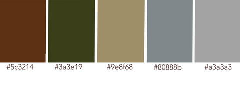
HEX colors (left to right): #5C3214, #3A3E19, #9E8F68, #80888B, #A3A3A3
Emotional Connection Through Art
This piece resonates deeply with many people who see it. The image of a lone church amid a storm mirrors our own human need for refuge, peace, and faith when life feels uncertain. It’s emotional, yes — but also comforting. A reminder that even when the world feels heavy, there’s light that still breaks through.
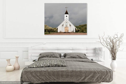
In home decor, Spiritual Warfare is incredibly versatile. Its neutral palette works beautifully in both modern and traditional spaces — adding serenity to a minimalist room or grounding warmth to a rustic or farmhouse style. It pairs easily with natural wood, muted greens, or soft linen textures.
Why I Love This Piece
Spiritual Warfare is one of those images that stays with you. It’s bold but peaceful, haunting yet hopeful. The color palette captures that contrast — the quiet strength of faith standing firm in the storm. It’s one of my most thought-provoking pieces, often sparking conversation and reflection wherever it’s displayed.
Love this moody gray and white palette? See more nature-inspired art and color stories in my Color Palette & Moodboard series.
Art that sparks a memory, causes you to pause, reflect, and remember — while adding beauty and peace to your space.
Does this piece spark a memory for you? It might be just what your home needs — a reminder of strength, stillness, and grace through life’s storms.
Happy decorating!
~ Lisa

Leave a comment
This site is protected by hCaptcha and the hCaptcha Privacy Policy and Terms of Service apply.