Designing with Panoramic Photography
Transforming Spaces with Sweeping Views
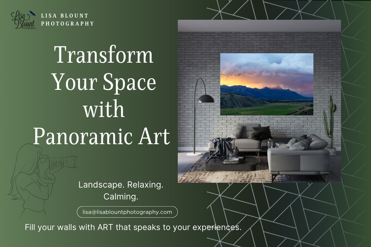
Panoramic photography is a designer’s secret weapon. Those wide, immersive views add depth, enhance scale, and create an unmistakable focal point. Used thoughtfully, panoramic wall art can transform living rooms, hallways, offices—anywhere you want big impact with a sense of place.
1) Choose the Right Wall: Give It Room to Breathe
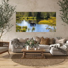
Panoramas love long, open walls—above sofas, beds, mantels, or along corridors. The elongated format draws the eye horizontally, visually widening the room and adding flow.

Artist tip: Over furniture, aim for the artwork width to span about 60–75% of the piece below it (so an 8-foot sofa pairs beautifully with a 58–72" panorama).
2) Match the Mood: Subject Drives the Space
Let the room’s purpose guide the subject. Tranquil lakes and misty forests are perfect for bedrooms and reading nooks. Dynamic cityscapes or crashing waves bring energy to offices and lounges. A panoramic of Peyto Lake, for example, adds calm adventure—ideal for nature-forward living rooms.
3) Scale Like a Pro: Go Big for Immersion
Undersized panoramas lose their magic. If you’re on the fence, size up for a gallery-worthy presence—especially in rooms with high ceilings or long sightlines.
4) Framing vs. Frameless: Choose the Finish that Fits
Frames add polish in traditional or formal spaces. For a modern, minimal vibe, choose frameless options like TruLife® Acrylic or ChromaLuxe Metal—they float cleanly on the wall and keep focus on the image.
Lisa’s take: I’ve gone frameless for years—it lets the art breathe and eliminates “which frame?” stress. If you want modern gallery clarity, go Acrylic; if you want bold texture, choose Metal.
5) Create Depth: Make Small Rooms Feel Larger
 Wide horizons, coastlines, or alpine valleys act like a “window” that expands the room. Narrow hallways benefit from long, leading-line compositions that pull you forward.
Real-life fix: When a bath renovation removed a window, I inset a large nature print into the original frame—it now reads like a view to a woodsy stream.
6) Color Strategy: Harmonize or Intentionally Contrast
Echo a room’s palette for cohesion, or let the panorama be the bold accent in a neutral space. Blues from alpine lakes calm a cool-toned living room; a black-and-white skyline adds sophistication to minimal interiors.
7) Light It Like Art: Reveal Texture and Tone

Use picture lights, track heads, or adjustable recessed spots to skim the surface and bring out detail. Natural light is lovely—just avoid harsh, direct sun. At night, lower-output LEDs give a soft gallery glow.
Hanging & lighting quick guide: Center at ~60" off floor; leave 6–10" above furniture. Aim lights at ~30–45° to reduce glare and enhance texture.
8) Let It Lead: Keep Surroundings Simple
Panoramas carry strong presence. Support them with restrained furniture silhouettes, layered textures, and a tight color story—so the art remains the focal point.

9) Curate a Story: Pair with Complementary Works
Panoramas can anchor a gallery wall. Surround them with smaller close-ups (foliage, textures, details) that echo color or theme for a layered, collected look.
10) Make It Personal: Choose Places that Matter
The most compelling panoramas hold memory—national parks you’ve visited, coastlines you love, skylines that feel like home. That connection is what turns a beautiful room into a meaningful one.

Love modern, frameless presentation?
Explore Large-Scale Wall Art in TruLife® Acrylic or Metal for a gallery-clean look.
Want help picking the perfect size?
Request a Design Preview and I’ll mock up the art on your wall.
Happy Decorating! ~ Lisa
Leave a comment
This site is protected by hCaptcha and the hCaptcha Privacy Policy and Terms of Service apply.