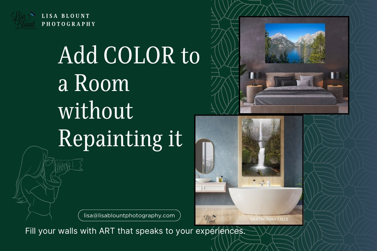
How to Add Color to a Room Without Repainting or Starting Over
Sometimes a room does not need a full makeover. It just needs a shift.
Maybe the furniture is fine. The paint color still works. The layout makes sense. And yet something feels unfinished, flat, or a little too safe. The space may technically be “done,” but it does not quite feel alive.
That is often where color comes in.
For many people, the idea of adding more color to a room immediately sounds expensive or exhausting. Repainting walls, replacing rugs, swapping out furniture, or rethinking the entire palette can quickly become more than anyone wants to take on. The good news is that color does not have to start with paint. One of the easiest ways to change the emotional tone of a room is through artwork.
Art can introduce color without overwhelming a space. It can soften a room, energize it, ground it, or make it feel more personal. It can pull together tones that already exist or gently lead a room in a new direction. And unlike a gallon of paint, it can move with you, evolve with your style, and create impact without requiring you to start over.

If you are trying to figure out how to add color to a room without repainting, artwork may be the missing piece. Here is how to think about it in a way that feels intentional, interesting, and actually useful.
Why Art Is One of the Easiest Ways to Change a Room
Color affects how a space feels long before anyone consciously thinks about why. A room filled with pale neutrals may feel calm, but it can also start to feel quiet to the point of disappearing. A darker room may feel moody and rich, but it may also need something to lift the energy. Even beautifully designed spaces can feel visually flat if everything stays in the same tonal range.
Art changes that because it adds more than just color. It adds movement, texture,

emotion, and focal points. It gives the eye somewhere to land. It creates contrast without clutter. It can connect a room to nature, to memory, to travel, or to a feeling you want to experience more often in that space.
This is especially true with nature-inspired and abstract photography. Instead of introducing color in a hard, manufactured way, it brings in tones that already exist in the natural world. Blues feel like water and open sky. Greens feel organic and restorative. Warm oranges and golds can bring life and warmth. Even a bold hit of pink can feel surprisingly grounded when it comes through petals, leaves, reflections, or botanical detail.
That is part of what makes artwork so effective. It adds color, but it also adds meaning.
Start with the Mood You Want the Room to Have
Before choosing art by color alone, it helps to ask a better question: how do you want the room to feel?
That answer gives you direction.
If you want a room to feel calmer, look for blues, watery textures, soft tonal transitions, and imagery that creates space rather than tension. If you want a room to feel more grounded, greens and earth tones often help. If you want to energize a room that feels too quiet, warmer shades like rust, amber, coral, orange, or hot pink can create a spark without requiring a full redesign.

Color works best when it supports the purpose of the room. A bedroom does not need the same energy as an entryway. A home office may need a different balance than a dining room. Once you think in terms of emotional tone, it becomes much easier to choose art that solves the problem instead of just filling a wall.
Using Calming Blues in Living Rooms, Bedrooms, and Offices
Blue is one of the most versatile colors in interior spaces because it can feel both restful and elevated. It can cool a warm room, open up a smaller space, and create a sense of ease without becoming boring. In artwork, blue often carries even more emotional depth because it tends to show up through water, sky, ice, and atmospheric detail.
This is where a blue-focused collection can become incredibly useful. If a room feels heavy, beige, or visually sleepy, blue art can wake it up without shouting. It creates movement while still keeping the environment calm.
In a living room, blue wall art can become a grounding focal point that helps balance upholstery, wood tones, and layered neutrals. If your sofa, chairs, and rug are all relatively safe in tone, a large-scale blue piece can keep the room from fading into sameness. It gives the room presence. It can also tie together scattered accent colors that otherwise feel disconnected.
In a bedroom, blue works beautifully because it supports rest. A serene piece above the bed or across from it can make the entire room feel more settled. This is especially true if the blue has variation in it—soft navy, misty aqua, icy tones, ocean-inspired movement, or layered abstract detail. The right artwork can create visual calm without making the room feel cold.
In a home office or professional office, blue can help a space feel polished and focused. If the room is practical but uninspired, blue art adds both professionalism and emotional ease. It feels intentional. It can soften harsh edges, brighten a neutral wall, and reduce the visual fatigue that often comes with work environments.
This is one reason blue art is such a strong solution when a room needs color but not chaos. It changes the tone without taking over.
How Nature Greens Make a Room Feel More Grounded
If blue creates calm, green creates restoration.
Green has a way of making a room feel more connected to life. It softens spaces that feel overly polished. It adds depth without heaviness. It works especially well in art because natural greens rarely read as flat. They carry variation, texture, shadow, and organic movement.

Nature-inspired abstract work in greens can be especially effective because it gives you the emotional benefits of the color without feeling theme-driven or overly literal. You are not decorating with “green stuff.” You are using art to introduce a visual exhale into the room.
In an entryway, green artwork can immediately set a different tone for the home. The entry is the first visual impression, and often it is overlooked. A well-placed piece with layered greens can make that space feel thoughtful and welcoming instead of transitional and forgettable. It tells people something about the mood of the home before they even step fully inside.
In a bathroom, green artwork can make the room feel more spa-like without requiring expensive changes. Bathrooms often rely on white, gray, chrome, and tile. That can feel clean, but also a little sterile. Green art introduces a softer, more organic note. It helps the room feel less clinical and more lived in.

In an office, green tones are especially useful because they counterbalance screens, hard surfaces, and repetitive visual input. Abstract botanical detail, close-up nature textures, or layered leaf imagery can give the eye something restorative to land on during the day.
Green does not have to be loud to be effective. In many rooms, it works precisely because it feels natural and easy.
Warm Orange and Golden Tones for Rooms That Need Energy
Some rooms are not missing calm. They are missing life.
This is where warmer tones come in.
Orange, amber, rust, and golden hues can make a room feel more welcoming, more expressive, and more complete. They are especially helpful in spaces that feel too gray, too safe, or too disconnected from the people who live there. Warm-toned artwork can bring energy into a room without making it feel loud if the palette is still rooted in nature.
In a dining room, warmer art often works beautifully because it supports conversation and presence. Dining rooms can easily become formal or visually stiff, especially if they lean heavily on wood, black accents, or neutral walls. A piece with orange or golden movement can bring warmth and make the room feel more alive when people gather there.

In an entry or hallway, warm color can create a sense of welcome. If the space feels transitional or overlooked, a piece that carries warmth can keep it from feeling like just a pass-through.
Even in a living room, a room that already has a calm base palette may benefit from a warm abstract or nature-inspired piece that introduces some contrast. This is especially effective if the room has a lot of creams, taupes, wood, or charcoal. The art does not need to dominate—it just needs to give the room a pulse.
Warm colors are often misunderstood as being “too much.” In reality, they are often what keep a space from feeling emotionally distant.
When a Bold Pop of Color Is Exactly What the Room Needs
Not every space needs a gentle shift. Some spaces need a jolt of personality.
That does not mean turning the whole room neon. It means using one intentional piece to introduce a color that changes the conversation.
This is where a piece like Color of Wet Caladium can do something special. A bold pop of hot pink layered through organic form and natural detail does more than add color. It adds surprise. It wakes up a room. It creates a memorable focal point. And because it comes through a botanical subject, it still feels connected to the natural world rather than artificial or trendy for trend’s sake.

In a powder room or bathroom, this kind of color can be magic. These are often the perfect spaces for a stronger statement because the room is smaller and more self-contained. A vivid piece can make a bathroom feel designed instead of purely functional. It can add a sense of personality without requiring a full renovation.
In a dining room, a bold pink accent can add energy, confidence, and visual tension in the best way. It can shift the room from “nice” to memorable. Especially if the furniture and walls are relatively quiet, a strong piece can become the thing that gives the room its point of view.
In an office, a surprising pop of color can also work if the rest of the environment is clean and restrained. It signals creativity. It keeps the space from feeling too serious or generic. One vivid piece can do what an entire redesign would otherwise try to accomplish.
Used intentionally, bold color does not have to feel risky. It can feel alive.
How to Use Color in Different Rooms Without Making the House Feel Disconnected
One concern people often have is that if they use different colors in different rooms, the house will start to feel disjointed. That can happen—but usually only when the choices feel random.
The better approach is to let each room have its own emotional tone while still staying connected through subject matter, style, or quality.
That is one of the reasons a cohesive body of artwork can be so helpful. Even if one room leans blue, another green, and another has a bold pink accent, the home can still feel unified when the pieces share a similar artistic language. Nature-inspired photography, organic texture, abstract detail, and a consistent level of craftsmanship can tie everything together.
Think of it this way:
A bedroom may call for layered blues and softness.
An entryway may benefit from grounded greens.
A dining room may need warmth or energy.
A bathroom may be the perfect place for a vivid pink or botanical surprise.
An office may need a balance of calm and focus.
Those rooms do not need to match. They need to make sense.
Art helps create that sense because it lets each room have a personality while still reflecting the same overall aesthetic.

What to Do If a Room Feels Finished but Still Flat
This is one of the most common design problems people run into, and it is rarely solved by buying more stuff.
If a room feels finished but still flat, it is often because it is missing contrast, scale, or emotional tone. Everything may coordinate, but nothing truly leads. The room may be pleasant, but it does not have a point of view.
That is where art can do what accessories cannot.
A large-scale piece can anchor a wall that feels too empty. A color-forward piece can create movement where everything feels muted. A nature-inspired abstract can soften a room that feels too sharp or structured. A bold botanical detail can make a quiet space feel intentional rather than generic.
In other words, art solves the problem not by filling space, but by changing the way the room is experienced.

Color Does Not Have to Start with Paint
If you have been staring at a room and thinking it needs something, but you do not want the hassle of repainting or starting from scratch, begin with art.
Let color come in through something layered, meaningful, and movable.
Let blue create calm where the room feels restless.
Let green restore what feels flat.
Let warmer tones revive what feels distant.
Let a bold pop of pink bring life where the room has become too safe.
Color does not have to be permanent to be powerful.
Sometimes all it takes is one piece that changes how the room feels when you walk in.
And often, that is enough to make the entire space feel new again.
About the Author

Lisa Blount is a fine art nature photographer known for creating artwork that brings color, texture, and emotional presence into interior spaces. Her work explores the details of nature through large-scale wall art, abstract compositions, and calming organic imagery designed for homes, offices, and collected spaces.
Leave a comment
This site is protected by hCaptcha and the hCaptcha Privacy Policy and Terms of Service apply.