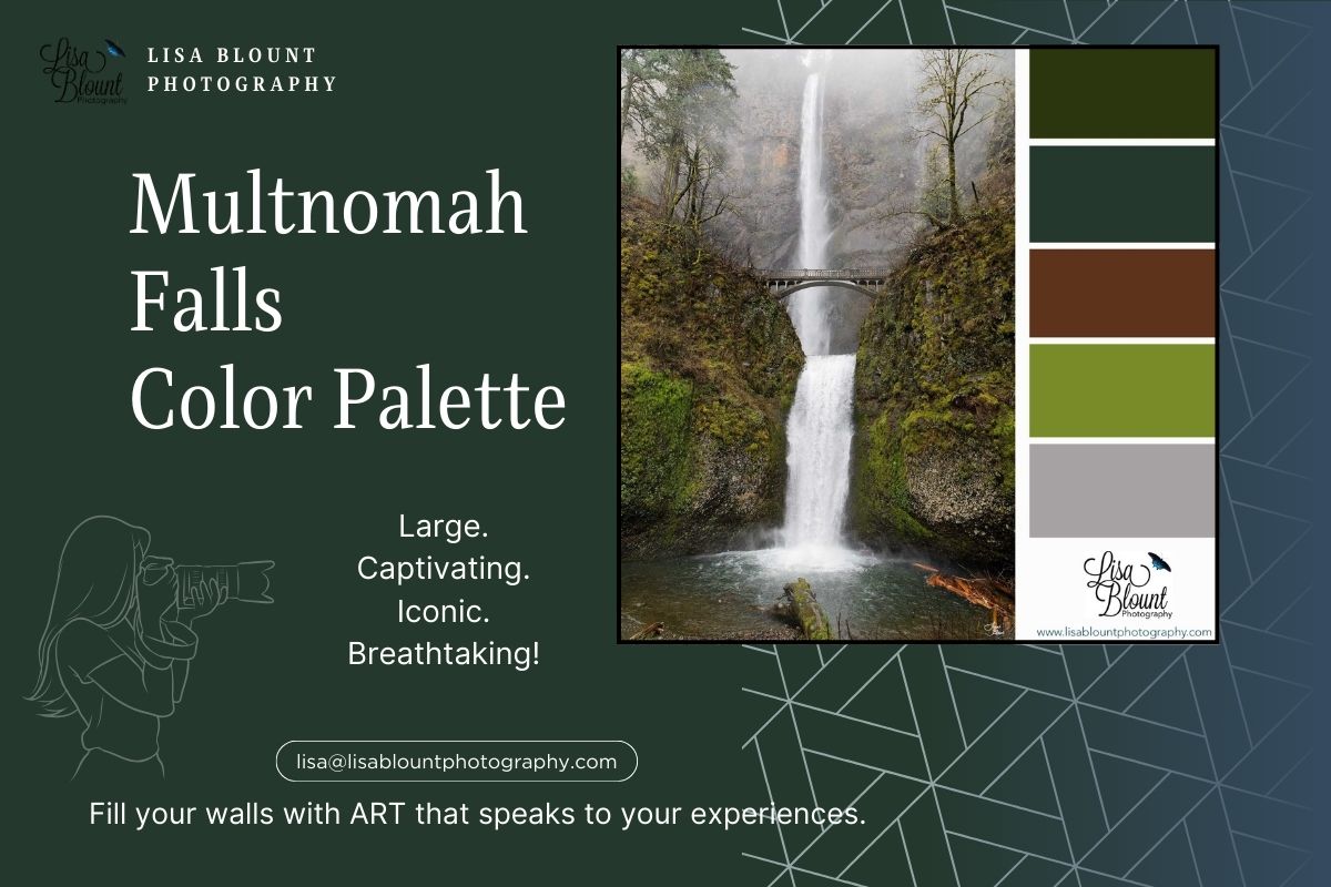
Multnomah Falls Breathtaking Color Palette with Art
Color Palette of Multnomah Falls
This fine art allows you to experience Oregon's stunning Multnomah Falls right in your own space!
The color palette of artwork Multnomah Falls is one that evokes a sense of serene nature. The capturing of dark greens, teals, browns, bright greens, and greys transports us to the beautiful Columbia River Gorge in Oregon landscape where this stunning waterfall is located. This fine art piece captures the tallest waterfall in Oregon and gives the viewer the opportunity to experience its beauty right in their own living room or office area decor.
What is a Color Palette
First things first …. What exactly is a color palette?
A color palette is a curated collection of colors that work together harmoniously, often used to create a specific mood, style, or visual effect in design and decor. In the context of art and home decor, color palettes are essential for establishing a cohesive look that enhances the overall ambiance of a space. They help guide design choices, ensuring that every element—from wall art to furnishings—works seamlessly together.
One of the main purposes of a color palette is to create unity and balance in a room, making the space feel well-thought-out and inviting. Color palettes also evoke emotions; for instance, cool blues and greens can create a calming atmosphere, while warm oranges and reds evoke energy and warmth. Additionally, using a color palette helps streamline the decorating process by serving as a visual guide, making it easier to select complementary pieces, like art and accessories, that match and enhance the chosen theme. My mood boards, for example, are centered around art pieces, showcasing how colors from the art can be reflected throughout a space to create a unified and stylish look.
So simply put …. It helps you keep everything kinda matchy-matchy, blending and pleasing to the eye.
Now … onto the FUN STUFF!
Art and Color Palettes
|
The dominant green and brown tones in this artwork represent the lush forest surrounding Multnomah Falls. These colors evoke a sense of calmness and tranquility, long associated with nature. They also symbolize growth and stability, as the forest stands strong and evergreen. The varying shades and patterns of greens and browns create a textured and dynamic composition that is a treat for the eyes. |
The deep, dark green of the evergreen trees is a striking contrast to the bright green of the foliage and moss-covered rocks. This contrast adds depth and dimension to the artwork, mimicking the layers of growth and beauty found in nature. The use of bright green in this piece also adds a pop of color, drawing the eye towards the lush foliage and giving the artwork a sense of vibrancy and life.
Another key element of this moodboard is the splash of teal, which represents the water cascading down the falls. The bright and bold teal shade perfectly captures the force and energy of the waterfall. It also serves as a reminder of the constant flow of water that has carved the rock over time, creating the majestic falls we see today.
One of the most intriguing aspects of this piece is the use of grey in the background. This gives the artwork a sense of depth and perspective, drawing the eye towards the waterfall in the distance. The grey also adds a sense of calmness and balance, creating a visual representation of the peace and serenity one experiences when surrounded by nature.
| The subtle inclusion of brown in this artwork adds a much-needed earthy tone to the composition. It represents the rocky terrain and cliff face of the waterfall, grounding the piece and giving it a sense of stability. The varying shades and textures of brown add to the overall complexity and beauty of the piece, making it a true work of art. |
|
The subtle inclusion of brown in this artwork adds a much-needed earthy tone to the composition. It represents the rocky terrain and cliff face of the waterfall, grounding the piece and giving it a sense of stability. The varying shades and textures of brown add to the overall complexity and beauty of the piece, making it a true work of art.
This moodboard for Multnomah Falls is not just limited to the natural colors found in the artwork. It also includes shades of white and black found in the snowflakes and rocks. These colors add a touch of contrast to the piece and make it visually interesting. They also highlight the changing seasons and elements within the artwork – from green and vibrant in the summer to cold and snowy in the winter.
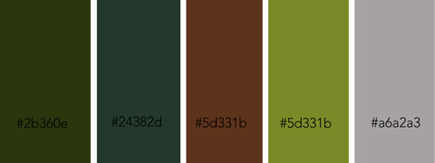
Hex numbers (from left to right):
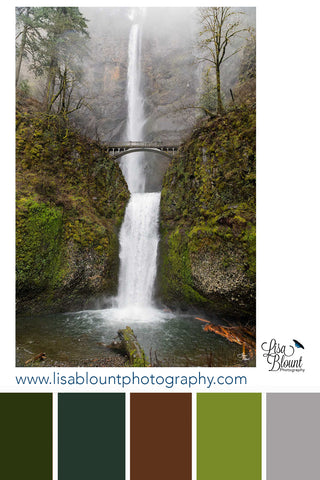
#2b360e. #24382d #5d331b. #798b28. #a6a2a3.
The overall harmony and balance of this color palette make it a versatile choice for any space. The greens and browns represent earthy and natural tones, while the inclusion of bright green and teal adds a splash of color and energy. The use of grey and white creates a sense of calmness and purity, while black adds a touch of contrast and depth. All these shades come together to create a harmonious and visually stunning moodboard that captures the essence of Multnomah Falls.
Featuring Art: MULTNOMAH FALLS
The fine art piece featured in this moodboard is not just a beautiful representation of Multnomah Falls but also a reminder of the ever-changing nature of our world. The photograph was taken on a damp, rainy day, with snowflakes falling and blanketing the landscape. This adds a unique and magical touch to the artwork, depicting the waterfall in a way that is not often captured. It also serves as a reminder that nature is constantly evolving and adapting to its surroundings.

Multnomah Falls moodboard is a stunning representation of the artwork and the wonderful nature that inspired it. The use of various shades of green, brown, teal, and grey creates a harmonious and dynamic color palette that captures the beauty, tranquility, and energy of Multnomah Falls. This moodboard can easily be adapted to any space, bringing a touch of nature and serenity into your own home or office. Let these earthy and vibrant colors transport you to the beautiful Oregon landscape and inspire you to appreciate the ever-changing world around us.
Art that sparks a memory, causes you to pause, reflect and remember - while adding beauty.
Does this piece spark a memory for you? This color palette and piece of fine art may be just what you need to upgrade your decor!
Quick links:
- Lisa Blount Photography Home page with all my art listed
- Color Palette and Moodboard Blog
Leave a comment
This site is protected by hCaptcha and the hCaptcha Privacy Policy and Terms of Service apply.