Irresistible Coral Flower - Jungle Geranium Mood Board
Coral or Orange - either way, it’s seems like such a difficult color to pair with. I wasn’t quite sure how to pair anything with this piece of ART. All I knew was that - I really (I mean really!) liked the color of these flowers. There are so many different shades of coral/orange in this - and against the dark green leaves. How can this piece not speak to you?

What is a Mood Board
I really want to jump in and tell you all about this art - because it’s such a fun piece and I love (L.O.V.E) the colors - they are SO CHEERFUL!! But before we get too far - let’s give a quick definition of what a mood board is and how I use them.
A mood board is an essential tool in the design process that acts as a visual to work from, bringing together inspiration and concepts to help plan a visually pleasing look for a space. For those passionate about interior design (or those who just need a visual! 🙋🏼♀️), mood boards offer a way to experiment with colors, textures, and decor elements before making any big decisions.
When it comes to art-centered mood boards, they play a critical role in connecting key pieces of fine art with furniture, color palettes, and room accents to make the room cohesive and functional. By assembling various images, fabric swatches, and design ideas on a board, you can envision how a piece of art might transform an entire room and set the tone for its decor.
Whether you're integrating a bold abstract painting or a serene landscape photograph, a mood board helps ensure that every element—from the color of the walls to the choice of accessories—flows seamlessly around the art. This practice is a creative and practical step that helps designers and homeowners visualize a unified, inspired space where every piece feels intentional and connected.
My story for this (and how I got started with this) is when I had to design, build from scratch and decorate a barndominium. Being a very visual person, I was struggling. Fortunately, I’m also a list maker and project manager …. So off to technology I went to build mood boards, a walk thru plan of the barndominium and suddenly it all came together and the final product is exactly what was requested. I find that mood boards allow me to both “chip and chunk” rooms and walls (basically take a big task and only work on a piece of it - chips and chunks of the whole big project ) until finally it fits together. It is my method to keep from getting overwhelmed (which I easily fall into analysis paralysis when walking thru room decor and design!!).
Now … onto the FUN STUFF!
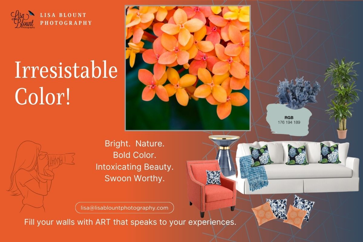
Color of Coral Fire - Jungle Geranium
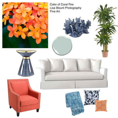
I looked at this piece - and tried to think out of the box. Orange and … what. Orange and yellow (nah). Orange and White (maybe). Orange and …. Blue? (BINGO!) Once I started pulling those colors together, I couldn’t believe how well they coordinated.
|
|
When you invest in ART, you want to showcase that art - and make sure it’s appreciated by others as much as you appreciate it! As a fine art photographer, I have seen clients struggle with where to place pieces of art. Clients love the piece of art, but they just aren’t sure how to incorporate it with their furniture, or how it could fit in a room or what decor could coordinate. So I’ve created a possible grouping of furniture items to pair along with some of my art. Allowing the visualization of art and furniture together to make a statement in your home or office. |
If you’ve read my other blogs - you know the drill … here’s my steps and the links to where I found the items that I felt paired well with the ART.
Here are the 5 steps in action!
Select your focal point
Decide which piece(s) of art will be the focal point or inspiration point for the room/building.
|
Color of Coral Fire - Featured art. This art is available in either TruLife Acrylic or High Gloss Chromaluxe Metal. The TruLife Acrylic is non-reflective/non-glare, it appears as though you’re looking through a window at the picture, and is a little more modern and contemporary. The Chromaluxe Metal is a glossier, does reflect light but is cheaper. You can’t go wrong with either one - it just depends on what your preference, style and budget can afford. |
Custom sizing is available on all of my ART... so don’t let size limit your creativity when designing your room!
A little bit about this art: It was taken in St. Lucia at the entrance of our resort. It was such a beautiful welcoming color. Truly a tropical flower set for a tropical vacation.
Build a theme
The theme …. WELCOMING COLOR!!
With this piece of ART, it’s a statement piece - but not an overbearing one. It invites and welcomes you into the room - calmly. It adds a warmth and glow to the room - making the invitation one to be accepted.
Create a Mood Board
Visualize the items together. I do this by creating a mood board. Whether I pick these exact items or not - this gives me a starting place for options for the room, for the art, and my style.
Tweak it until you’re happy with it.
Not everyone’s style is the same - so incorporate YOU into it. That will ensure that you love it!
Start shopping!
I'm not gonna lie - this is my favorite part!!! Especially when I order it ... it's like Christmas when the package arrives!!!
Below are the items that I selected to go with this art / moodboard. The resources are below, or feel free to be creative for your style. Either way - find something that you will LOVE! Afterall, it is your home or office!
The Color of Coral Fire fine art is very calming - and I have matched it with white, blue and more coral.

I selected a white leather couch, primarily because I wanted to see if this ART could go into an upscale room - and it can! It is so flexible!! The leather couch may feel cold, however when paired with navy pillows and orange pillows, a throw and accessories - it turns into a cozy little spot to sink down into.
To keep the color flowing from the ART into the furniture, I selected a beautiful accent chair. This ties them together and makes it look like the room is well thought out and planned.
For even more pops of blue I added a blue accent table and some blue coral.
The base color of the room is Benjamin Moore - Seacliffe Heights collection.
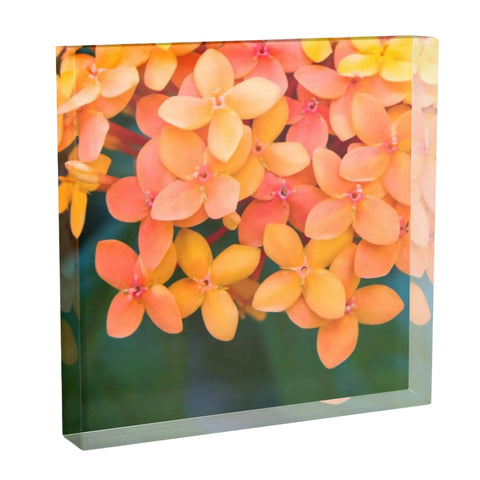
| As a side note - some of my art comes in acrylic blocks. This is how you can collect art - even when you don’t have an empty wall! The 6x6 and 8x8 Acrylic Blocks can be placed anywhere - shelves, tables, mantles. Wherever you need a pop of color or relaxation or a statement piece … you can place an acrylic block. |
|

#kirklands #artisanti #benjaminmoore #livingspaces #homedepot #wayfair

|
I love taking pictures! It started at a very young age and has stuck with me my whole life. I have used my pictures to capture memories and moments that later allow you to reflect. I never considered moving forward and creating art until several challenging events happened which allowed me to rethink my priorities. |
I then had the opportunity to collaborate with a designer and had SO MUCH FUN!! Having a 30 year career in Corporate America, has allowed me the opportunity to now do what I love - take pictures and add some beautiful art to your world!
To find other pieces of art, please check out my website!
(Please note: I am not affiliated with or promoting any of the furniture or accessories - only my art. I will give you links to where I found the items, but it’s only for reference - as I simply found pieces that I liked that I felt could enhance the art when grouped with it.)
Leave a comment
This site is protected by hCaptcha and the hCaptcha Privacy Policy and Terms of Service apply.