The Power of Color: How Travel Inspires Art, Emotion, and Home Design
Travel has a way of imprinting color into memory.
The turquoise glow of a glacial lake. The layered blues of an endless coastline. Warm terracotta tones baked into old stone streets. Long after a trip ends, it’s often the colors that stay with us—quietly shaping how we remember a place and how it made us feel.
Those moments are where my work begins.
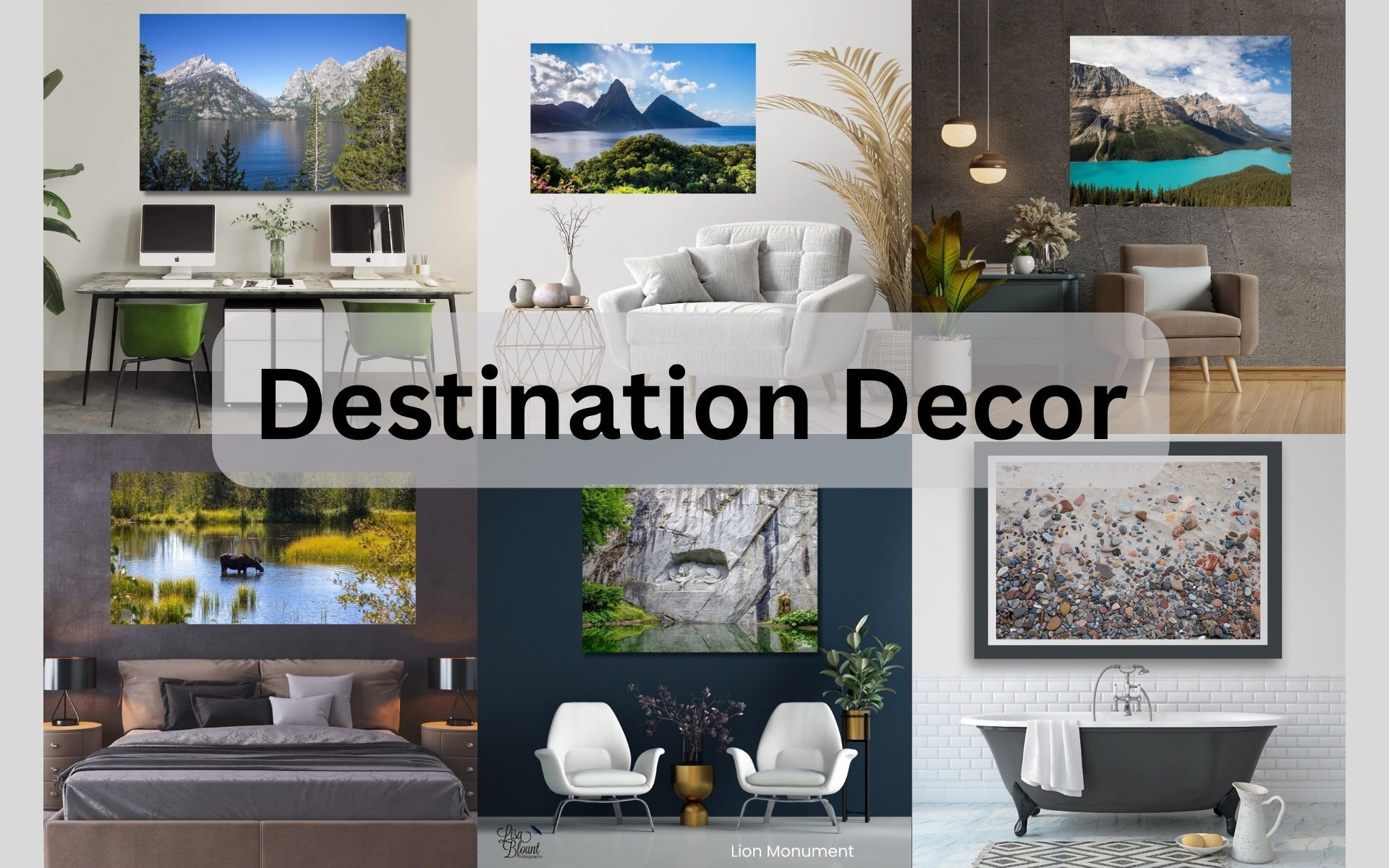
This isn’t about decorating with souvenirs or chasing trends. It’s about translating experiences into travel-inspired fine art and intentional color palettes—so your home reflects not just how you live, but where you’ve been and what resonates with you.
How Travel Shapes the Art We’re Drawn To
When you travel, you absorb more than landscapes—you absorb atmosphere.
The icy blues of the Canadian Rockies. The saturated greens of tropical foliage. The quiet neutrals of weathered coastlines. Each destination carries its own visual language, shaped by light, climate, and geography.

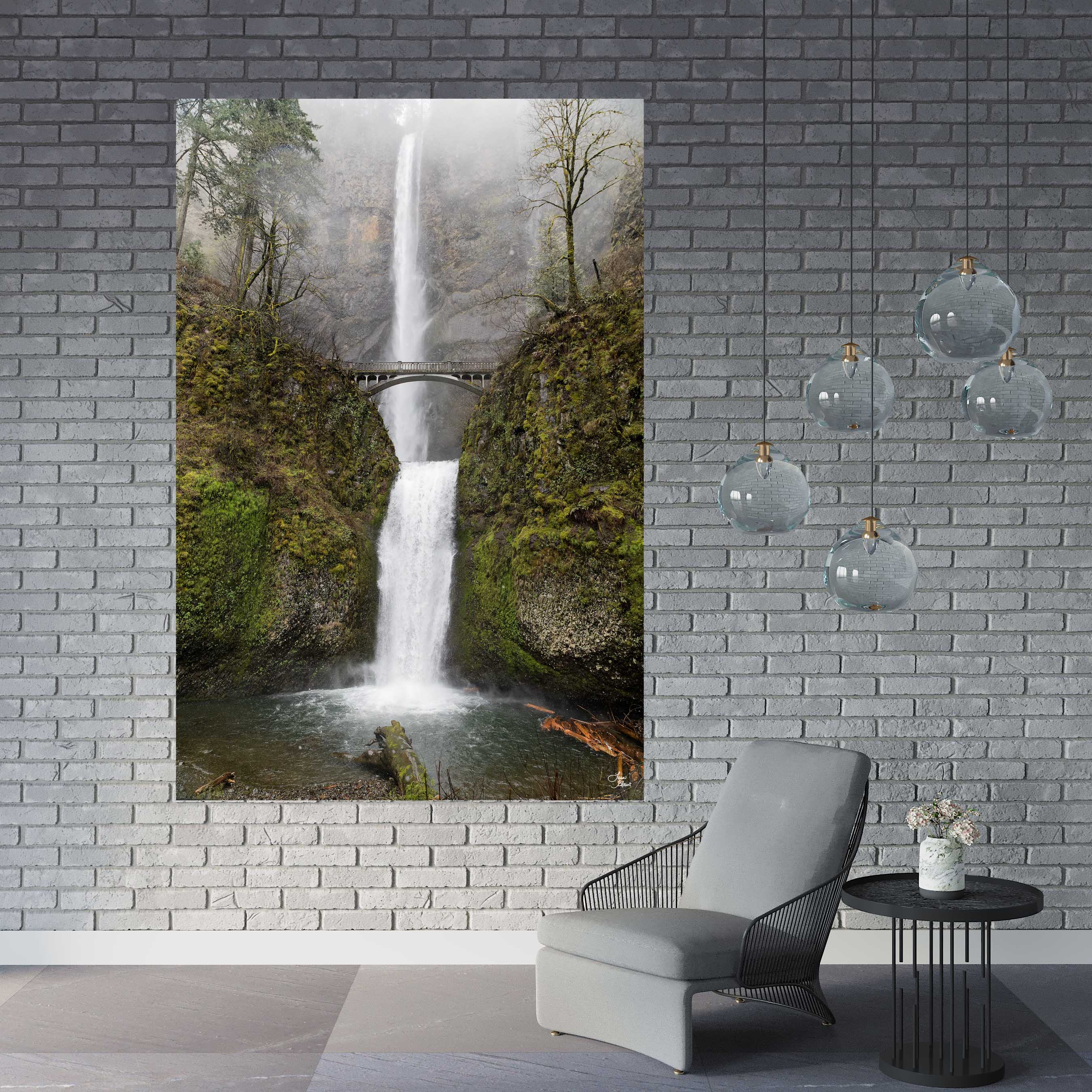
As an artist, I photograph places with this in mind. I’m not just capturing a view—I’m paying attention to color relationships, texture, movement, and mood. That’s what allows an image to live beyond a travel memory and become something that belongs on a wall.
A piece like Peyto Lake isn’t just about a famous viewpoint—it’s about the tension between glacial blues and grounded earth tones. The same is true for coastal scenes, abstract water studies, or botanical close-ups. Each one holds the visual DNA of a place.
When collectors connect with these works, it’s often because the colors trigger something familiar—a trip taken, a feeling remembered, or a destination still calling.
The Emotional Power of Color at Home
Color is deeply emotional. It influences how we feel in a space, how we move through it, and how long we want to stay.
Blues & Greens — Calm, Presence, Restoration
Inspired by oceans, alpine lakes, and forest canopies, these tones bring a sense of ease and balance. They’re ideal for living rooms, bedrooms, and wellness spaces where calm matters.
Explore artwork that leans into this palette in collections like Shades of Calm or destination pieces rooted in water and landscape.
Warm Earth Tones — Comfort, Energy, Grounding
Think sunlit stone, desert paths, vineyard soil, and golden light. These colors add warmth and depth, working beautifully in gathering spaces like dining rooms or entryways.
Neutrals — Breathing Room for the Eye 
Soft grays, creams, and weathered textures create a foundation that allows bolder elements—or art—to shine. Neutrals inspired by travel tend to feel organic rather than stark.
Soft Pastels — Lightness & Quiet Joy
Drawn from early morning skies and coastal villages, pastels offer subtle emotion without overpowering a room. They work especially well in intimate spaces or layered interiors.
From Destination to Wall: Turning Travel Into Art
This is where travel-inspired design becomes personal.
Rather than matching a room first, I encourage starting with the piece that speaks to you. The art becomes the anchor—the color story unfolds from there.
Collectors often build palettes directly from artwork: pulling tones into upholstery, rugs, paint, or accent pieces. That’s why many of my clients also gravitate toward color palette mood boards—they make it easier to visualize how art and space work together.
Whether it’s a large-scale statement piece or a smaller work that quietly completes a room, the goal is the same: art that feels intentional, not incidental.
Ways to Bring Travel-Inspired Color Into Your Home
1. Start with Art That Holds Meaning
Large fine art photography has the power to define a space. A destination-driven piece can instantly shift the mood of a room—without needing layers of decor.
If a place has stayed with you, that’s often a sign it belongs on your wall.
2. Build a Palette Around a Favorite Place
Choose a destination that matters to you and identify its dominant colors. Cool alpine blues. Coastal neutrals. Lush greens. Let those tones guide your choices throughout the room.

3. Layer with Textiles & Subtle Accents
Once your palette is established, reinforce it through texture—pillows, throws, rugs, or ceramics. These elements should support the art, not compete with it.
4. Embrace Texture & Pattern
Travel isn’t only visual—it’s tactile. Stone, water, foliage, weathered surfaces. Abstract photography often captures these textures beautifully, making it a natural fit for layered interiors.
5. Let Personal Memories Live in the Details
The most compelling spaces don’t feel staged—they feel lived in. When art reflects your experiences, it adds depth that can’t be replicated with trend-driven decor.
Why Travel-Inspired Art Endures
Trends fade. Experiences don’t.
Art rooted in travel and nature carries a timeless quality because it’s grounded in something real. It invites reflection. It creates pause. It connects your home to the wider world.
That’s why destination-inspired pieces work so beautifully in both modern and classic interiors—they don’t belong to a moment in time. They belong to a story.
Final Thoughts
The power of color lies in its ability to transport us.
When you bring travel-inspired art into your home, you’re not just filling a wall—you’re carrying an experience forward. One that continues to shape how a space feels, day after day.
If you’re drawn to a piece because it reminds you of somewhere you’ve been—or somewhere you still dream of going—trust that instinct. That’s where meaningful design begins.
Art should do more than decorate. It should connect.
~ Lisa
Explore destination-driven pieces or reach out if you’d like help selecting artwork that fits your space and story.

Leave a comment
This site is protected by hCaptcha and the hCaptcha Privacy Policy and Terms of Service apply.