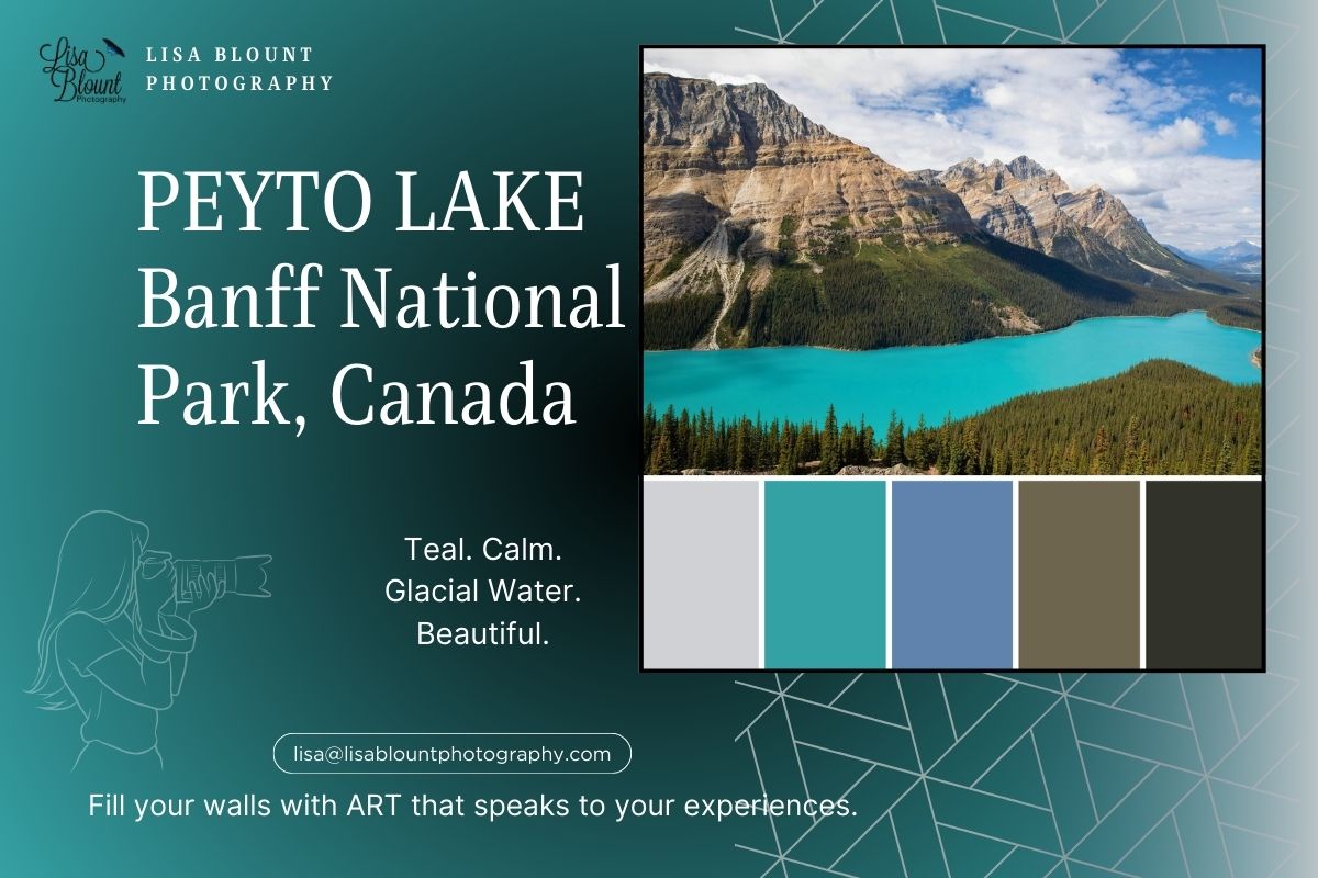
Peyto Lake Color Palette for Calm, Nature-Inspired Decor
The Peyto Lake color palette blends vibrant turquoise, deep forest greens, and grounding earth tones into a calm, nature-inspired scheme for home decor. Inspired by Banff’s iconic glacial lake, this color story works beautifully in living rooms, bedrooms, offices, and other spaces where you want the room to feel more serene, open, and grounded.
If you love decorating with turquoise, blue green wall art, and natural tones, Peyto Lake offers a strong visual anchor. The palette feels fresh and airy, but still rooted—making it especially useful for interiors that lean mountain-inspired, modern rustic, nature-led, or quietly minimal.

What Is a Color Palette?
A color palette is a curated set of hues that work together to create a mood and a cohesive look. In interiors, a clear palette keeps everything harmonious—from wall art to textiles and finishes—so the space feels intentional and inviting.
Cool blues and greens generally signal calm, while warm oranges and reds bring energy. I often build palettes directly from a key art piece (you’ll see this in my mood boards), then echo those colors in furnishings and accents for a polished, “pulled together” room.
Art + Palette: Why Peyto Lake Works
The expansive view from Bow Summit in Banff National Park sets the scene: a turquoise, glacial-fed lake surrounded by evergreen forest and rugged, textured peaks. That dramatic contrast of cool water, deep greens, and grounded neutrals feels both serene and strong—ideal for living rooms, bedrooms, and restorative workspaces.

Turquoise: Calm & Clarity
Peyto’s signature turquoise comes from glacial rock flour suspended in the water. The effect is soothing and clarifying—great for spaces where you want to breathe a little deeper. As a focal color in large wall art, turquoise helps set a peaceful tone in living rooms and offices.

Green: Growth & Harmony
The surrounding evergreens bring balance and renewal. Layer soft or muted greens through plants, throws, or cabinetry to echo the artwork and create a grounded, biophilic feel.

Earthy Browns & Greys: Stability & Strength
Rocky mountain neutrals keep the palette from floating away—add wood tones, stone textures, and matte black or iron accents to ground the look and add quiet strength.

Putting It Together
The Peyto Lake palette—turquoise, deep greens, and earth tones—creates a layered, calming scheme that feels both modern and timeless. Use the art as your anchor, then repeat those hues in 1–2 supporting elements (pillows, rug, cabinet, or accent chair) for cohesion without overmatching.
Art that sparks a memory, and makes you pause, reflect, and remember—while adding beauty. Does this piece spark a memory for you? The Peyto Lake palette and artwork may be just the calming focal point your space needs.
If you’re planning a visit, see the official Peyto Lake page for tips.
As an artist, I love sharing palettes and mood boards that inspire. I hope these colors help you create a space that feels serene, grounded, and fully you.
Happy Decorating! ~ Lisa


Leave a comment
This site is protected by hCaptcha and the hCaptcha Privacy Policy and Terms of Service apply.