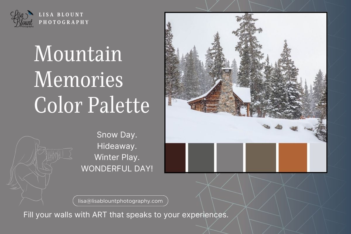
Color Palette of Mountain Memories
There’s something magical about a snow-covered cabin tucked deep in the trees—the kind of quiet that makes you stop and breathe. Mountain Memories captures that feeling for me: a rustic log cabin, tall evergreens, and soft winter light. It’s cozy, calm, and a little nostalgic—like the best kind of ski trip memory bottled up for your wall.
What Is a Color Palette?
A color palette is simply a set of hues that work together to create a mood. In decor, it’s your guide for picking paint, textiles, and accents so everything feels intentional instead of “almost there.” I like to start with the colors inside the art—then echo those tones around the room for a pulled-together look.
Art + Color Notes
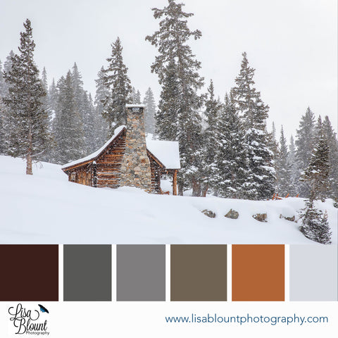
White (snow): Peaceful, pure, and quieting. It sets the calm and lets texture do the talking.
Brown (cabin): Warmth and welcome. It anchors the scene and brings that fireside feeling.
Gray (sky & pine shadows): Soft contrast and depth—moody in the best way, without feeling heavy.
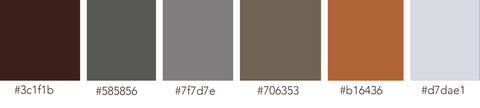
HEX (left → right): #3C1F1B, #585856, #7F7D7E, #706353, #B16436, #D7DAE1
Where This Shines
- Living room: Layer creamy throws, textured knits, and wood accents to echo the cabin warmth.
- Bedroom: Misty gray walls with linen bedding and a caramel leather bench—instant retreat.
- Office/library: Deep charcoal paint, brass task lighting, and this piece centered above a credenza = cozy focus zone.

Styling Tips
- Mix warm woods (walnut, oak) with soft whites and wool textures for that alpine-lodge feel.
- Let the art breathe: center it at eye level and give 6–8 inches of margin above furniture.
- Keep metals muted (bronze, blackened steel) so the wood + snow palette stays the star.
Art that sparks a memory and makes you pause. Does this piece bring a trip—or a dream trip—to mind?
Happy decorating! — Lisa


Leave a comment
This site is protected by hCaptcha and the hCaptcha Privacy Policy and Terms of Service apply.